DATE
2021
DELIVERABLES
- Branding
- Copy Writing
- Video
- Web
- Marketing
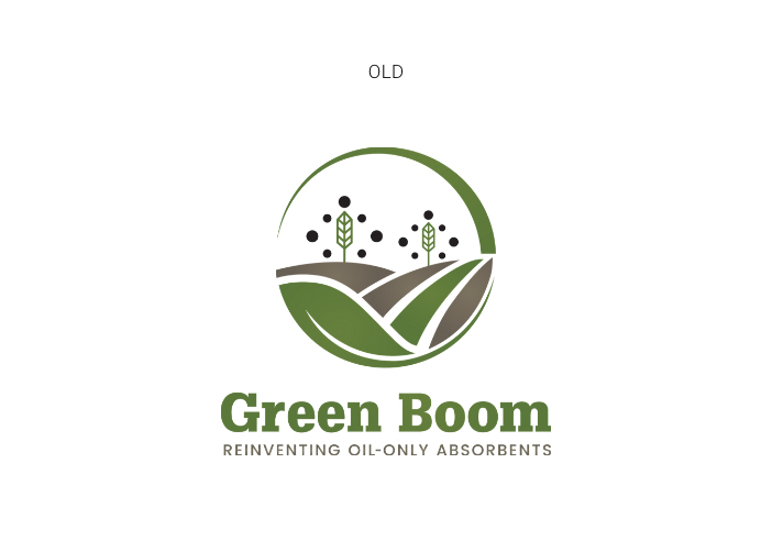
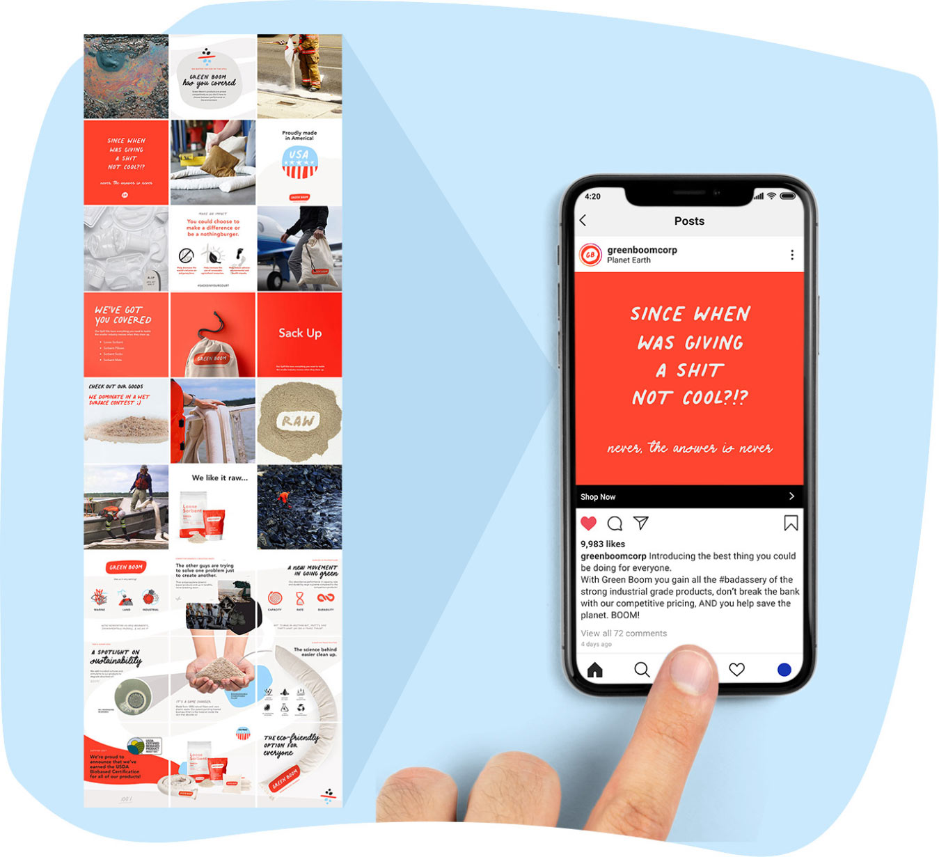
Green Boom
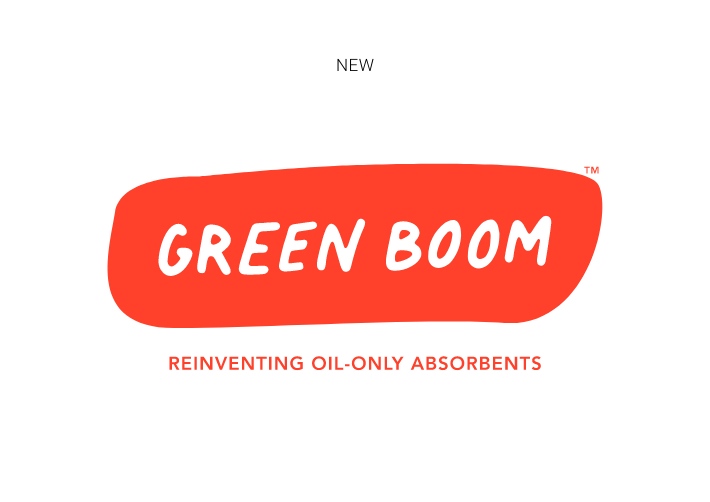
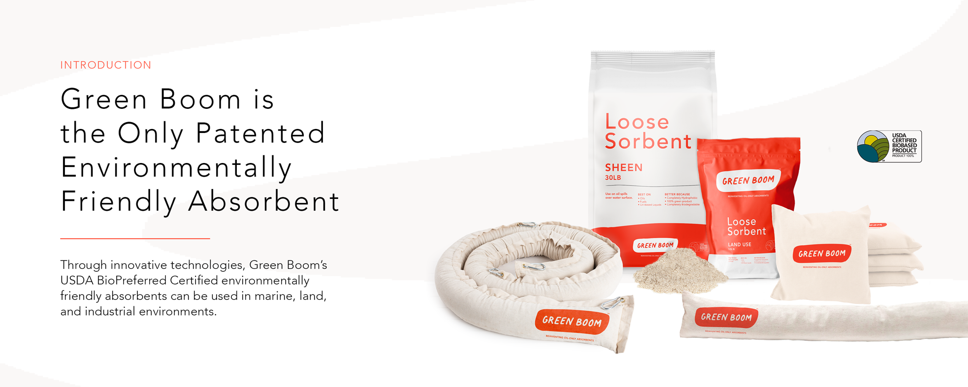
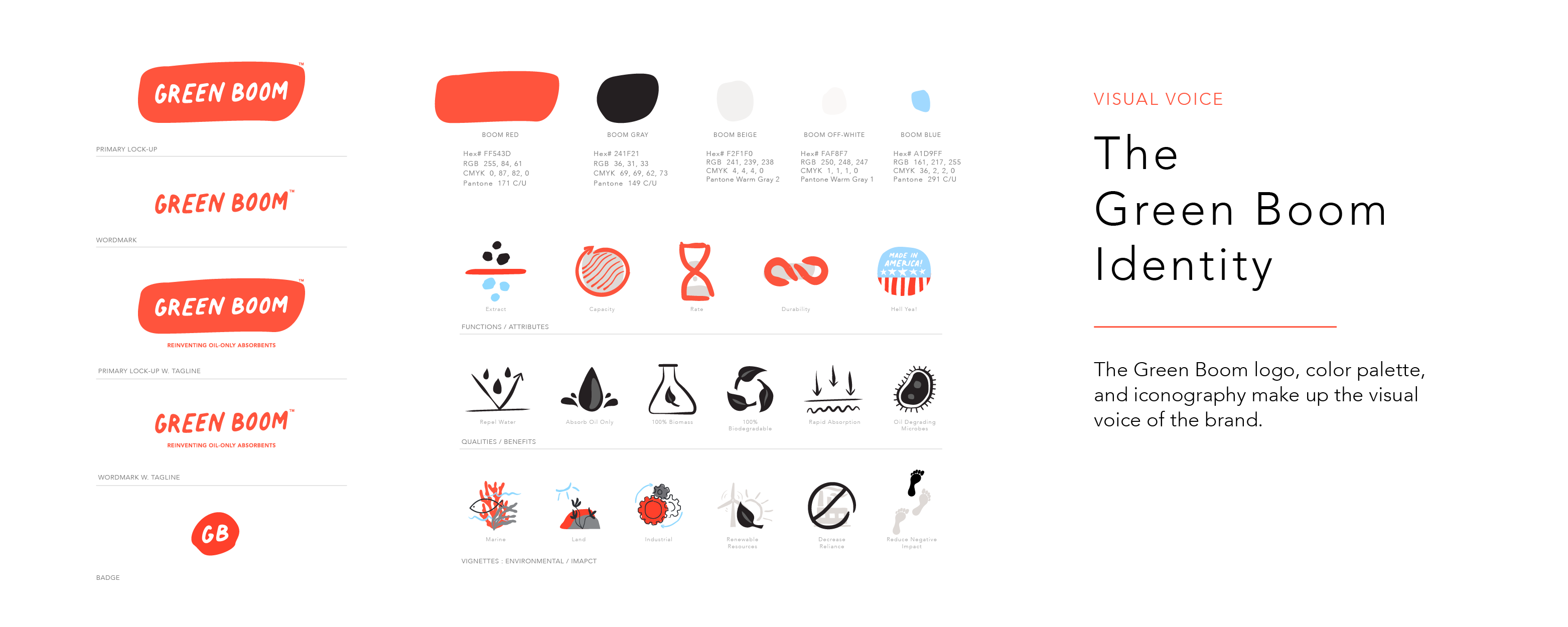
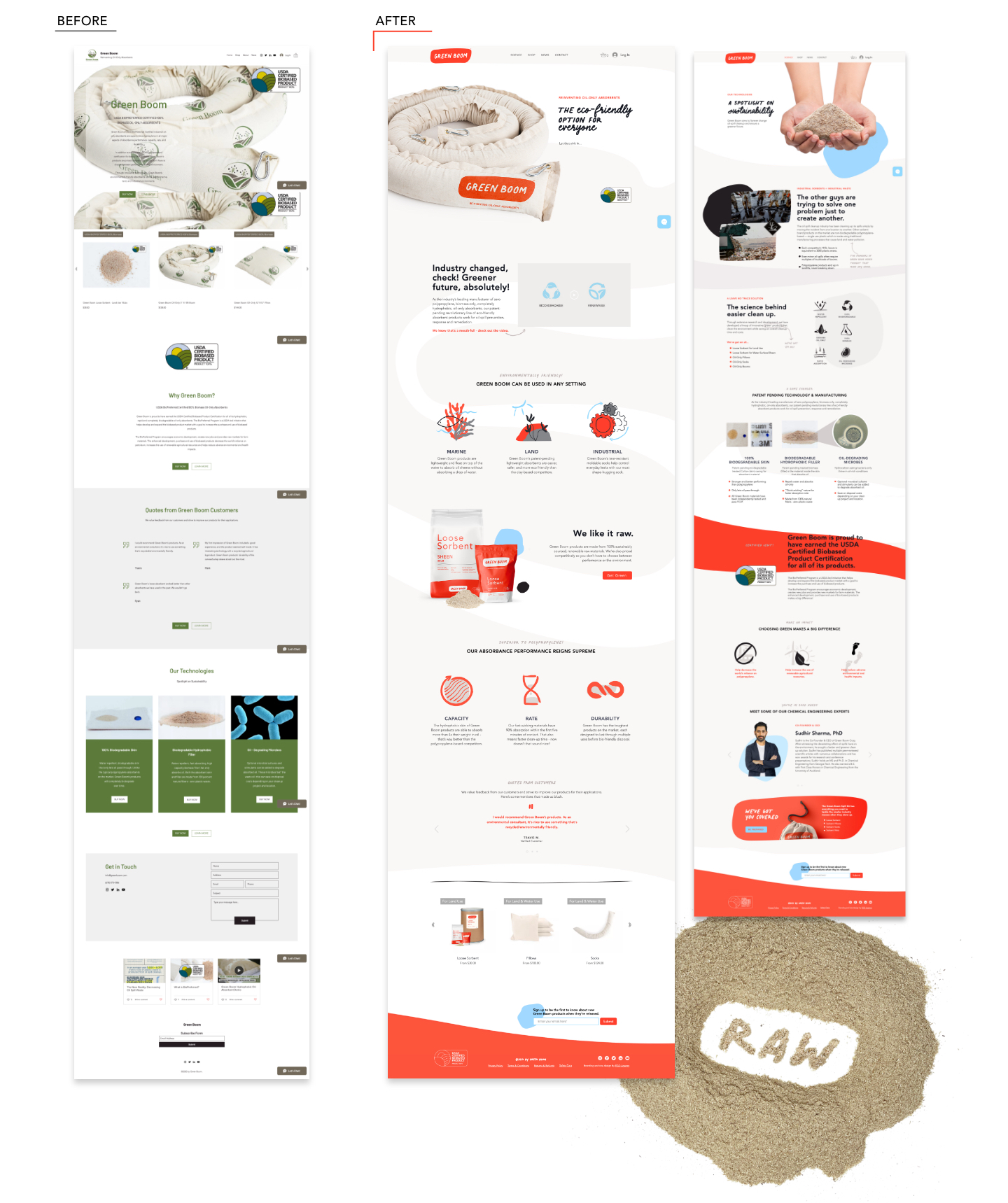
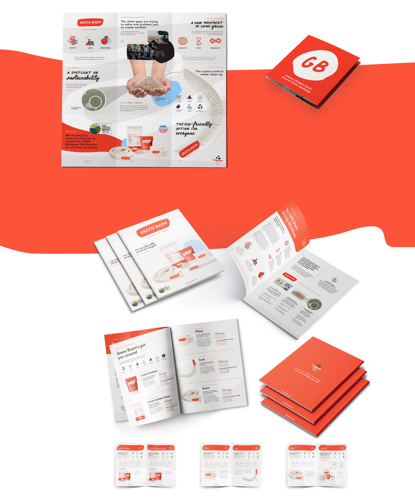
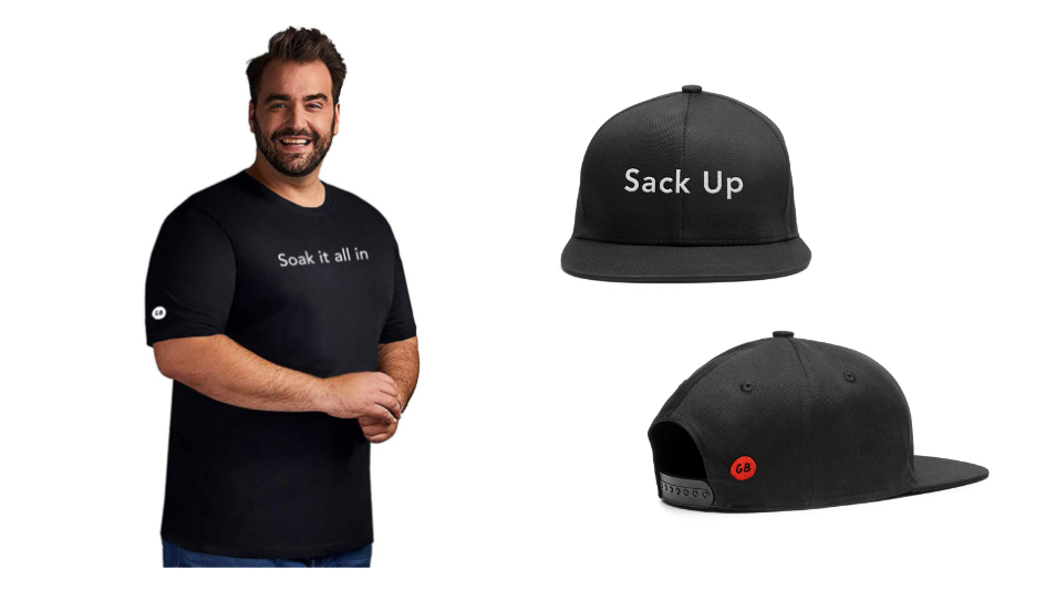
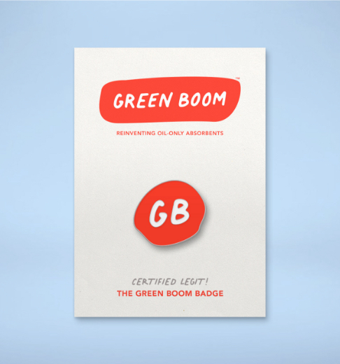
Our approach to rebranding Green Boom was rooted around the aposematic visuals we see occur biologically in nature. Taking that to the next step we wanted to redefine what it meant to be green, in an industry so saturated by companies touting “being green”, and more often than not using the color green, we chose to differentiate ourselves by standing our ground with a memorable and organic shape to reference to product, approachable typeface, and vibrantly balanced color palette.

Let it sink in....
This organic level of bright bold advertising in both plants and animals indicating possibly hazardous properties, or just a “hey, heads up” quality, aligned well with the precautionary factors seen around oil spill clean-ups. Hence the selection of our intrepidly new reddish-orange branding.