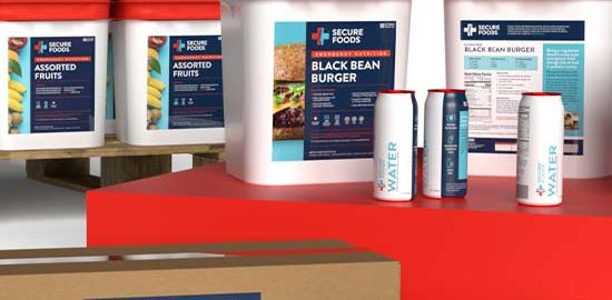
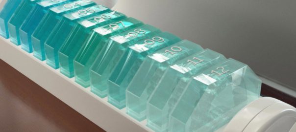
Established for the sole purpose of providing peace of mind for organizations, institutions, and individuals with food, sustenance and nutrition in times of emergency.
We were brought in to create the Secure Foods identity including: logo, palette, typography, iconography, packaging, sales collateral, and website.
Our approach to rebranding Green Boom was rooted around the aposematic visuals we see occur biologically in nature. Taking that to the next step we wanted to redefine what it meant to be green, in an industry so saturated by companies touting “being green”, and more often than not using the color green, we chose to differentiate ourselves by standing our ground with a memorable and organic shape to reference to product, approachable typeface, and vibrantly balanced color palette.
Together with Drop and Marvel, we helped bring keyboard lovers everywhere limited-edition keycaps — all inspired by your (and our) favorite Super Heroes.
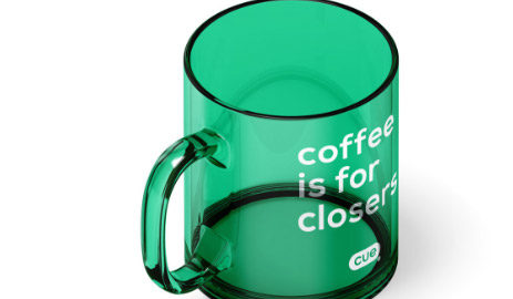
It started with the overwhelming need to empower call center and customer service agents with a better tool to drive success through the complexities of adopting new technologies. Not just for improved call results, but also thinking through the user experience on both the agent AND the customer side. Meet Cue, the virtual overlay.
Check out itscue.com
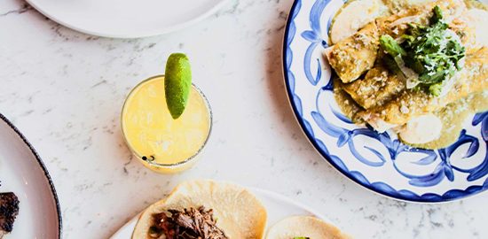
We proudly share a studio with No Architecture, with whom we occasionally collaborate when the stars align. For example, NoArch was designing an innovative Mexican restaurant in Fort Mill, SC, when they asked us to join the party (and working with this team IS a party…)
We created the exterior iconic blade neon sign as well as various elements of the interior — not just the visuals but the background “story” of the fabled (but fictitious) Molino Family and their culinary exploits. Once the build was complete, we went on to design and produce the website, and assisted with video and photography. Included in the graphics package was a series of line art and illustrations to infuse character and style throughout the menu.
Photography: Fredrik Brauer
Visit Website
We were asked to help develop a new brand. Working closely with a group of Orthodontists we developed several concepts that covered the e-commerce platform, branded content, and tone of voice. We then created a suite of brand assets as a toolkit that could be used by the Star Aligners marketing team in their communications.
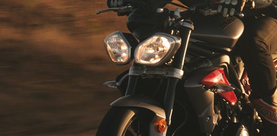
In 2018 we were introduced to motorcycle helmets that integrate AR (augmented reality) as the primary technology helping riders to see all that surrounds them. Utilizing a camera on the rear of the helmet and a pop-up display just below the right eye, this technology communicates not only the visuals of what’s happening behind the rider but also integrates voice command, music, phone, and navigation.
We had 60 days from the start of the project to design a tradeshow booth for the CES (Consumer Electronics Show) in Las Vegas. In under 100 days, we produced a 20’x10’ booth that incorporated a 20’x4’ video wall. We captured content via GoPros, steadycam, and drone, and used 3D modeled renderings and live-action footage to curate a short seamless video that through “moments,” revealed the depth and breadth of the technology.
Christopher Wood was our co-producer on the booth and video, and we enjoyed powerful assistance from Harley Musch, Joel Silverman, Matthew Jones Photography, Carson Nyquist, WitnessCo and Stephen Wahl.
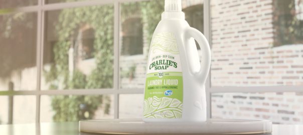
For more than four years, EGD+ served as Charlie’s Soap agency of record. As their marketing arm, we produced a new website, designed tradeshow booths, created video for a variety of applications, and 3D modeling and renderings (in collaboration with WitnessCo).
We also produced fresh content for their social media accounts and, in just over a year on a very limited budget, helped them grow their following by over 25%.
View Website